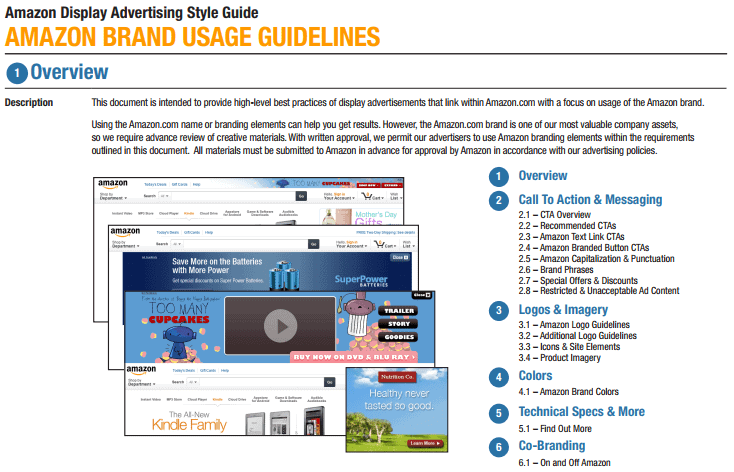
The most important thing when developing brand guidelines is creating a consistent brand image throughout all your forms of representation. This consistency helps raise your brand recognition throughout your industry, and that breeds a sense of trust with your customers. Trust in turn commands loyalty and will hopefully translate into sales through the spread of your reputation by your customers.
In most cases, your biggest representative is your website. When customers and prospective customers visit your site, they expect it to match your brand and have a consistent look and feel throughout. A brand guideline document will ensure that all of the different people working on your website can maintain that consistent look and feel even though they might represent different disciplines and areas of the website design and implementation process. Let’s take a look at what goes into creating a brand guideline document.
What is a brand guideline document?
A brand guideline document contains pre-defined logos, images, graphics and rules for designers and developers to help them make every page of the website have a consistent look and feel. Having the ability for multiple resources to work on different aspects of the website is a huge gain in productivity, but at the end you want the website to look like it was created by one person with a cohesive and consistent vision.
By having all of the different style elements of the website predefined, you take the guesswork out of styling the website and leave very little room for interpretation on the part of the designers, developers, writers, third-party contractors, etc. It will also help to ensure a consistent look and feel throughout all the different types of pages that are included on the website such as your homepage, email, blogs and eCommerce pages.
What makes up a brand guideline document?
Brand Definition: This includes an in-depth study of what the customer is trying to say with their brand. Below are the main components of the brand study.
- Mission: Clearly and concisely state the mission statement of the company.
- Vision: Define where the company wishes to go in the future and how they wish to get there.
- Target Audience: Who will the website be used to communicate to? Define who your audience is. This can be done with the help of customer personas.
- Personality: This should describe how the site will feel to customers while they’re browsing. For example, is the site business minded and straightforward or whimsical and friendly?
- Core Values: This will be a declaration of the principles of the company and how they make decisions and take actions.
Typeset Definition: One of the most important tools employed in any website is the typography. The font family, style, weight, and color should be specifically defined for every situation. Also, the different types of headlines should be clearly defined from h1 to h6. Then the body text, bold and italic variations that can be used should be outlined. If you can code and this will be an electronic document, it is best to include examples in HTML with all formatting in place so that they can be easily copied into style sheets.
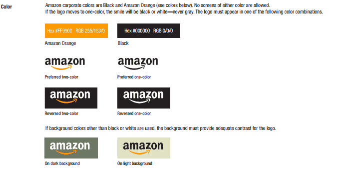
Color Palette: Everything on the website must be color coded and well defined. Studies on how the viewers of advertising materials identify certain colors with certain brands are amazing. For example, most people would associate red and white with the Coke brand. You should also define neutral colors for inactive objects as well. Most people don’t think about how the color of objects that are read-only or disabled look, but it is a very important tool to guide the user on how to use the site. Don’t forget to include the exact color codes for each color so that there won’t be any discrepancies in the shades of colors. You don’t want to leave it up the designer or developer to try and match your colors. You want them to be precise and consistent.
Voice Guide: This determines how the website speaks to the user. If the customer is whimsical or funny, then you might want to code things like error messages and warnings differently than if the customer is strictly business. For example, a warning message for a button that is disabled might say, “Hey, you can’t do that yet, Jack!” instead of “This option is currently unavailable. Please fill out the appropriate information before continuing”.
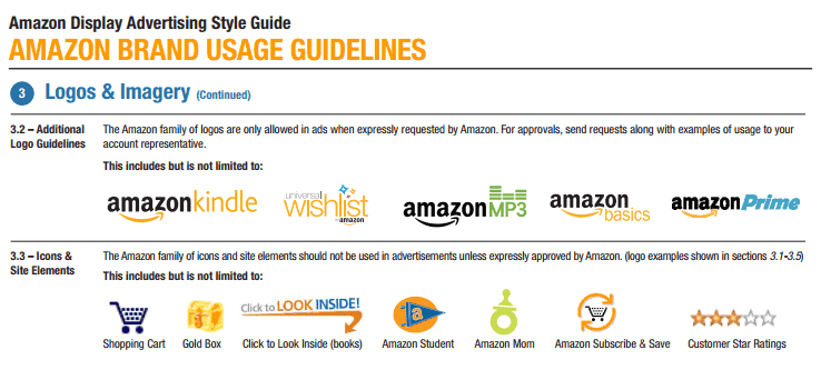
Icons: Iconography is the principal of images conveying specific meanings without the need for words. For example, you can include little images of a pencil on a piece of paper in the lines of grid items to let the user know that they can click on this icon to edit the item on that specific line of the grid. Several different sizes of the icon should be included along with active and inactive images for use in button or link styling. Also, consider your customer’s image and take into account the voice of the website, so you don’t have cartoon characters as icons for a banking or insurance company.
Images: Once again, pay attention to the mission, vision, and voice of the site when including images. Try to use images that convey the emotions of the site and add to its overall impact. Include a variety of images and make them different sizes so that they can be used in different contexts throughout the site.
Pages or Forms: Try to define a clear hierarchy and menu layout for the different forms on the website. Also, include canned messages, tooltips, hover help text and other pieces of text that can be routinely displayed on the site.
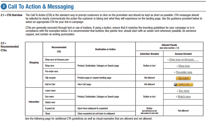
Button Images and Behaviors: These should reflect the color pallet, iconography, and typography previously defined in the earlier steps of the document. Pay attention to the voice of the site here as well to make the buttons cohesive throughout. Also, provide active and inactive versions of the buttons as well as different sizes.
Spacing: Spacing helps define the distance between the different graphic elements and provide a consistent look and feel. This should be developed in relation to the different elements in the site such as headlines, body text, image text and the text inside of grid cells just to name a few.
FAQ: This section provides the designers and developers a concise set of rules of what they can and can’t do with the elements provided in the style guide. For example, the spatial orientation and rotation of images. This helps to cut down on the freelance interpretation of the different elements so that you don’t have pages and other sections that look different from the rest of the site. The site should look like it was developed by one conscientious person with a clear, concise style in mind.
Examples: This section should provide examples of all of the contexts and possible uses of the elements in the style guide. This includes text around images and button interactions to name just a few. This is an invaluable resource to help cut down on different interpretations of the styles and behaviors contained in the guideline document. These examples can be showcased within each of the sections listed above, or they can be compiled in a section of their own at the end of the document.
A well-designed brand guideline document will help to create websites that are consistent and convey the mission and vision of the customer. They should be well thought out, robust and exact. The brand guidelines document should be, for the most part, set before design and development begins–with the exception of the FAQ and Examples sections as these may need to be edited as you come across new instances. But overall, if the brand guidelines are thorough and completely filled out, the customer’s website should provide a valuable representation of the customer’s brand.
Contact us today and discover how you develop your own brand guidelines or strengthen and implement your brand guidelines through all aspects of your website. We are here to help!
